

Demystifying Color
Years ago I was walking down Main Street in Middlebury, and a gentleman stopped and asked, “Weren’t you the architect who designed the Elderly Services building?”
I replied puzzled, “I was one of the architects, yes.”
“Well, because of you, my wife made me repaint every room in our house! Thanks a lot.”
I chuckled a bit, and he softened, “and the cheerful colors really do make a difference.”
Choosing paint colors for your home, and really any building, inside and out is never and easy task. Some things we consider as we recommend colors to our clients are:
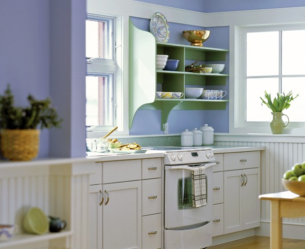
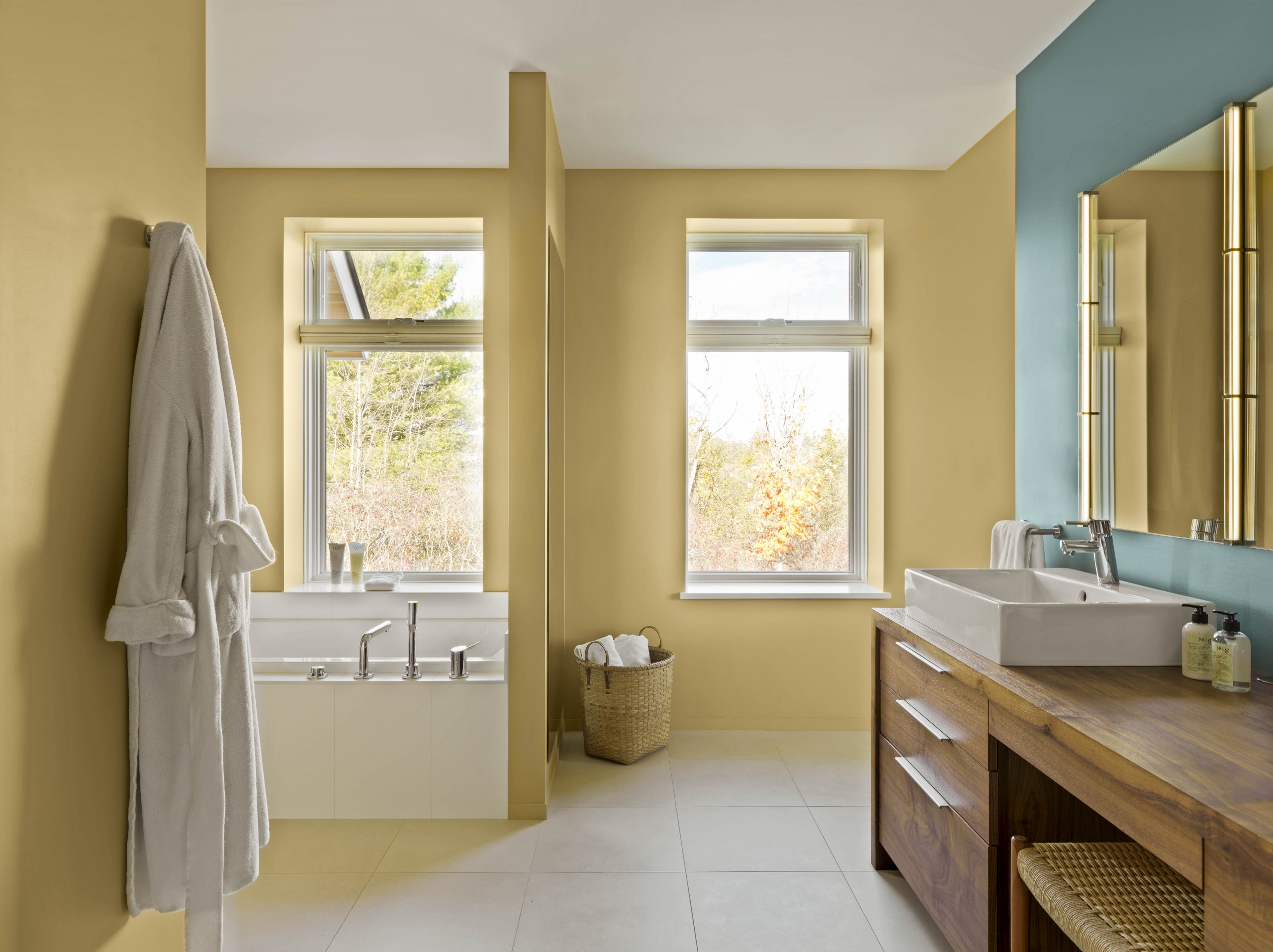
- Light Reflectance Value (LRV) – this is a percentage of the total amount of light that falls on a surface that is reflected back. Most paint chips have this value printed on the back for your use. The lighter a color, the higher the LRV percentage. For example, white is nearly 100% depending on the white. The darker and more saturated the color, the lower the percentage. On the interior, use light colors on ceilings and in spaces where brightness is desired. Reserve darker colors for ambiance and accent. LRV is also relevant to heat. For example, when we have a thermal mass such as a stone or tile floor in front of a south-facing window, we often choose a dark colored one as it will absorb heat and contribute to the passive heating of a space.
- It’s Only Paint – Relatively speaking, paint is cheap. Do a mock up. Most paint companies sell small samples (enough to paint a 4’ x 4’ area). Choose a couple of colors and try them out before committing 100%.
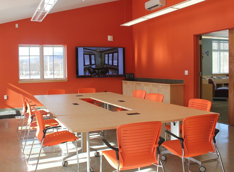
- Go Bold – Choose one “zinger” of a color and weave it throughout the project. It could be an accent paint on a column, a thread in your carpet, a display wall, a piece of furniture. Don’t use too many zingers.
- Know Your Finish – matte, eggshell, satin, semi-gloss, high gloss – these are different finishes, or sheens, that are available for your paint.
Flat or Matte – Absorbs light and is not so easy to clean. I almost never use this finish, but it is best for low-traffic, low-abuse areas.
Eggshell – In between satin and matte, this is a great finish for walls in common spaces. Not too shiny, but still cleanable. Best finish for darker colors as fewer flaws will show through.
Satin – Lustrous for sure and beautiful, yet trick y to tough up as variations in strokes or rolls are quite obvious.
Semi-Gloss/High-Gloss – Shiny! Use where cleanability is important. Consider for wood trim such as baseboards and trim at doors and windows. Also use for doors and windows themselves. Use high-gloss for furniture.
- Not All Whites Are the Same – For trim and other elements you want to appear “clean,” choose Bright White. For ceilings, use “Ceiling White.” For walls, get to know the subtleties of the many whites out there that have various undertones that make them cooler or warmer. I tend to use cooler whites on exterior surfaces and warmer whites inside. If your home or building is flowing and open, choose one white and stick to it! Coordinate your white with your “zinger.”
Finally, pick the colors that make you happy! It really is only paint, and it can be changed.
